Don’t miss the opportunity to discover the wonderful world of DECORATIVE VINYLS and how by combining several of them in different colours, you achieve wonderful and impressive results that make the space you have decided to decorate unique.
How to Combine Different Colored Vinyls ?
Color is one of the easiest ways to impact the style of a room and set the tone. This makes then, that the color is one of the most important aspects in the art and the craft of the Decoration. The inspiration for colours is often taken from the closest natural colours, although later on some much bolder colours were added that also work very well as role models.
When decorating it is important to focus the color palette on natural tones such as:
- Pine Green or Hunter Green
- Burnt Orange
- Dark Grey
- Sky Blue
- Gold
- Dull Pink
- Burgundy (Wine Colour)
In addition to this natural and earthy palette, you can also include some more intense colors, such as: turquoise, bright yellow and deep red. The key to using the more intense colors is to use them less often; for example, a tile with a red accent on the fireplace in the middle of a dark gray field would go very well.
Remember that many natural tones are equally important, which often means leaving the woodwork in a natural finish, or a warm spot, rather than painting it. Furniture is also often left in natural shades. Perfectly reproduced colors will provide a feast for the eyes, while non-woven fabric will allow the walls to breathe. Choose the perfect design and size for your wall mural or vinyl and allow new energy to enter.
Choosing colours for a well thought out decoration is easy when you follow one of the rules of interior design. These proven guides will help you find the best coordinating colours to use in decorating your space, using Wall Stickers
1.- Rule 60-30-10
Perhaps the oldest interior design rule, 60-30-10 divides a color scheme into percentages of color usage.
60% Main Color: The main color must represent 60% of the color used in the design of your room. This typically includes the color of the wall, the color of the floor (either carpet or area rug), and one or two pieces of furniture. It may also include treating the windows as curtains. All of these do not necessarily have to be solid colors, but the main color should always be prominent.
30% Secondary Color: The secondary color will represent 30% of the color scheme of the decoration. With only half the amount of primary color saturation, the secondary does not compete for attention in your overall design. Instead, it should contrast with the primary color. Being a different color, the secondary color creates depth and interest in the décor.
10% Highlight Color: The next color will be one third of the secondary color and one sixth of the main color. This color is designated as the highlight color. Its purpose is to give greater interest and contrast to the color scheme. It should be used throughout the decoration to draw attention more deeply into the design of the room.
Example of 60-30-10:
An example of a color scheme using the 60-30-10 rule includes:
- 60% Gray main color
- 30% Secondary colour light blue
- 10% Outstanding pink
2.- Color wheel or scale
The colour wheel is a great guide to help combine colours for interior design. This color circle presents primary, secondary and tertiary colors.
3.- Analogous Color
You can select analog colors from the color wheel for a color combination. These groupings are divided into three. Typically they consist of the primary, secondary, and tertiary colors, but they can be any of the three colors that are next to each other on the wheel. Apply the 60-30-10 rule for balanced color selection.
Examples include:
- Green (60%), yellow-green (30%) and yellow (10%)
- Yellow-orange (60%), orange (30%) and red-orange (10%)
- Blue-green (60%), blue (30%) and blue-purple (10%)
- Purple (60%), red-purple (30%) and red (10%)
4.- Complementary Colors
Another way to use the color wheel is by selecting complementary colors. These are the two colors that are directly opposite each other on the wheel. For example:
Yellow and purple: If you select these colors, add white or brown for an accent or highlight color.
Orange and Blue: When using these colors, select black or white for an accent or highlight color.
Red and Green: With these shades, choose gold or silver for an accent or highlight color.
5.- Rule of Three
The rule of three is similar to the three-color selections made in the analogous use of the color wheel, only you don’t have to use the color wheel to determine the three colors you use.
Odd Numbers in Design
The rule of three states that the use of odd numbers in design results in an interesting and balanced decoration. It is about using odd numbers, which are not limited to three and can address any odd number used in the design. However, three seems to be the optimal number when applying the rule to interior design.
Working with Three Colors
When the rule of three is followed, three colors are selected for use within the color scheme. You may wish to refer to the 60-30-10 as analog colors, or even complementary colors with an added accent color option. The choice is yours, as any combination can work when applying the rule of threes.
6.- Maintain the Flow of the Color Scheme
Once you’ve selected a color scheme for the room you’re decorating, choose one of them to wear throughout the building. You can always add other colours to the main colour when you move from one room to another. This strategy will keep your décor flowing without being too similar in every place.
How to Combine Wall and Ceiling Vinyl ?
Use the color matching theory explained at the beginning of the writing and then the combination of a wall and a ceiling vinyl. This is a great way to play with perspective and make your space look bigger. By extending elements of the vinyl from the wall to the ceiling, you remove a visual barrier and also expand the dimensions of the space. This technique looks especially good with simple, monochromatic images.
Ideas for Combining Wall Vinyl with Ceiling Extension
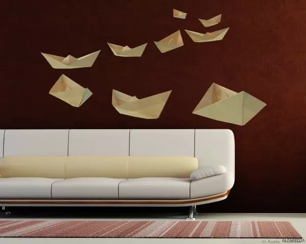
Murals or ceiling vinyls don’t have to cover everything. Panels, for example, are a dynamic and eye-catching way to incorporate ceiling vinyl into a space without taking up all the space. Designs like the one shown in the picture can be ideal for outlining open spaces and accommodating lighting elements or fire safety equipment, for example. Always use the theory of color matching explained at the beginning of the writing.
Related Topics in ALPHAPEDIA

HOW TO PAINT OLD FURNITURE ?

HOW TO RESTORE A WOODEN TABLE ?

HOW TO POLISH ALUMINIUM ?

HOW TO MAKE WOODEN BENCHES ?

HOW TO INSTALL PARQUET FLOORING ?

HOW TO CLEAN SUEDE SHOES ?
Other Products of Interest in ALPHAPEDIA

DRILL SANDER: How to Convert a Drill Into a Sander ?

CABLE REEL: Different Types of Spools, Brands and Offers

MAKITA BELT SANDER: Great Price on Qualified Products

SCREW: Definition, Examples, Types and Sizes For Wood

ACCESSORIES FOR Orbital and Drill SANDING MACHINES

DELTA SANDER: Prices, Brands and Offers
Decorating Wall With Vinyl Paper Adhesive Image


